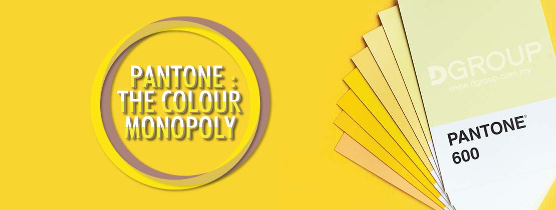
PANTONE : THE COLOUR MONOPOLY
Article by Nicholas. Updated October 05, 2021
Custom stickers and labels have been essential tools for all businesses of all stages. Besides providing crucial information about their products, they are used to stand out for advertising and branding purposes. Their success in carrying out those purposes depends on their logo's attractiveness, colours.
As insignificant as it may seem, colour influences thinking, reactions, and stimulates body hormones. It brings meanings and reflexes the emotions you want your customers to feel about your product.
Here's the thing though. Yellow.
Imagine the hassle both a designer and printer have to go through, going back and forth until the yellow that the printer produced is the exact yellow in the designer's mind. Or if a client points to a garden of sunflowers and says, "Hey, that's the yellow I want on my custom label!". It is not a guarantee that both parties perceive that yellow in the same way.
There are so many colours to choose from with too little vocabulary to describe them.
Thankfully, we have Pantone.
What is Pantone?
Before Pantone, every printing company had their own colour guide. Using the same example, each ink company had a different perspective on how "yellow" looked. Some were darker; some were orangey. And the worst part, even with all these variations, they might not be "yellow" the client had in mind.
Pantone, which means "all colours", combining pan and tone, developed its first colour matching system in 1963. Thanks to this system, theres no need for guessing, estimating, and describing anymore. Here's why.

The diagram above shows yellow with the code "012 C". This code belongs to this yellow. Other colours have their own unique codes as well. It's like how every stock counter has its own set of numbers. All the client has to do is to provide the colour code. The designer can then pass this information to the printer who orders the exact ink colour to print and provide the final product that matches the clients requests.
Isn't it just amazing that colour consistency becomes a reality? With this standardization, brands can enjoy this privilege regardless of any freelancers they work with or the locations they are in. Creatives can also look to impress their prospects with one-off projects.
Today, Pantone is universally used and recognized as the world's authority and monopoly on colour.
Pantone Matching System (PMS)
Pantone Matching System (PMS) is the colour standardization system that acts as the reference and guidance in colour matching & identification.
New colours are added to this system to provide a wider range of variations. Today, it is comprised of 2,161 solid colours. These are spot colours that are pre-mixed before they are used. You can already see a solid colour after only one pass of the machine. What you print on the spot is the final colour. Only different inks are needed when there are multiple colours.
Pantone colours are given a three or four-digit identification code followed by letters U, C or M. These letters tell us whether the paper stock is *Uncoated, *Coated or *Matte. You may ask," won't the colour look the same regardless of the paper stock type?" Well, while some colours may look similar when placed on different kinds of paper stock, the difference may be vast on others too.
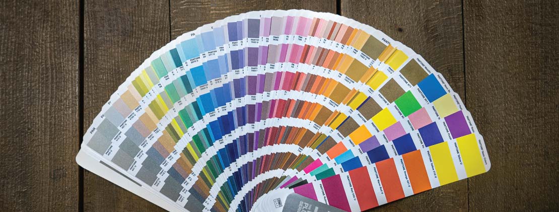
This is a Pantone book that lists the colours and their respective codes. The colours can also be found on Pantone's website. The book is definitely my preferred choice because it is a more reliable resource.
Misconception
You might be thinking, "why do we need the book when we can search the colours online? Aren't they the same since their codes are standardized? While you're not completely wrong, this is a common misconception.
In the printing industry, the colours you see on your labels are created by adopting the PMS or CMYK. PMS uses pre-mixed colours according to the codes given while CMYK, an acronym that stands for cyan, magenta, yellow and black, uses dots of inks of that 4 colours to create images.
On the other hand, the colours you see on your electronic devices use RGB system instead. Digital colour displays are formed using the combination of red, green, and blue colours only.
Every colour system is unique. There are attempts to create colours from a colour system using another colour system but there is only an approximation at best.
Using the same example of yellow, it is given the code of 012C in PMS. However, this exact yellow cannot be 100% replicated and is not correctly displayed on computer screens. Moreover, there is little to no consistency between displays even when identical computer screens are used due to different brightness and contrast settings.
What happens if you convert a CMYK colour to PMS?
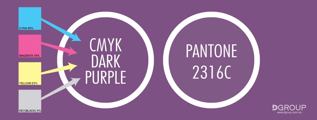
Are they the same?
Here, take a closer look at when they overlap.
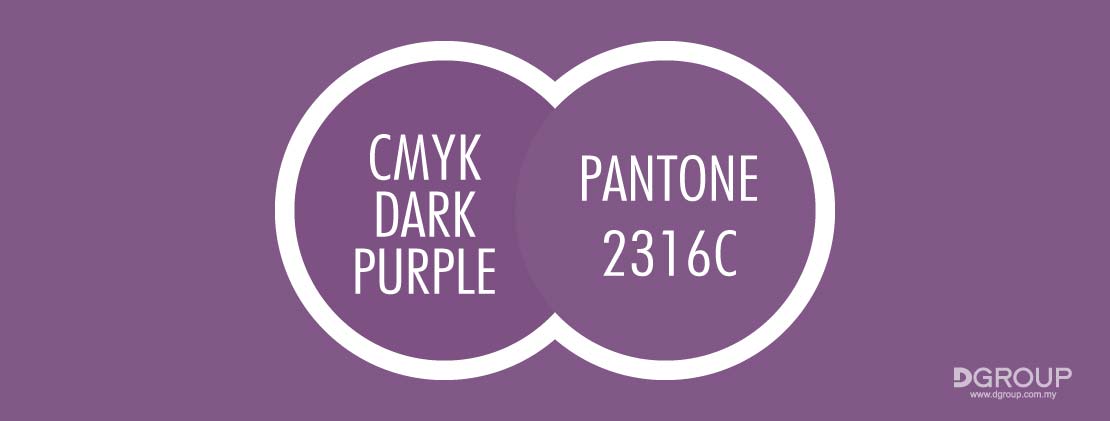
CMYK dark purple is a little darker compared to Pantone 2316 U. You must be wondering, "where did Pantone 2316 U come from?" It is the given Pantone colour code when converted to PMS from CMYK dark purple. The software recognizes that Pantone 2316 U is the closest alternative to CMYK dark purple, but they are certainly not 100% the same.
CMYK: Connecting the Dots
CMYK is a subtractive printing method that relies on layered dots of colours to mask the paper's white background. More ink on the paper means less light that reflects. Hence, the subtraction. Unlike Pantone that uses pre-mixed inks, CMYK is a four colour process that creates colours using only cyan, magenta, yellow and black.
Why is it not called CMYB since black starts with the letter "B"? "K" stands for key. Black is the key plate to outline images as the guide as it holds the most details in them. It is also to draw the line between black and blue.
Each colour is put on the paper separately and then layered. The printing of tiny dots that are applied at different angles, one next to the other is done by using special grids called halftone screens . Alignment must be done perfectly to prevent the resulting image from being blurry or out of focus.
Let's take a look at the example below.
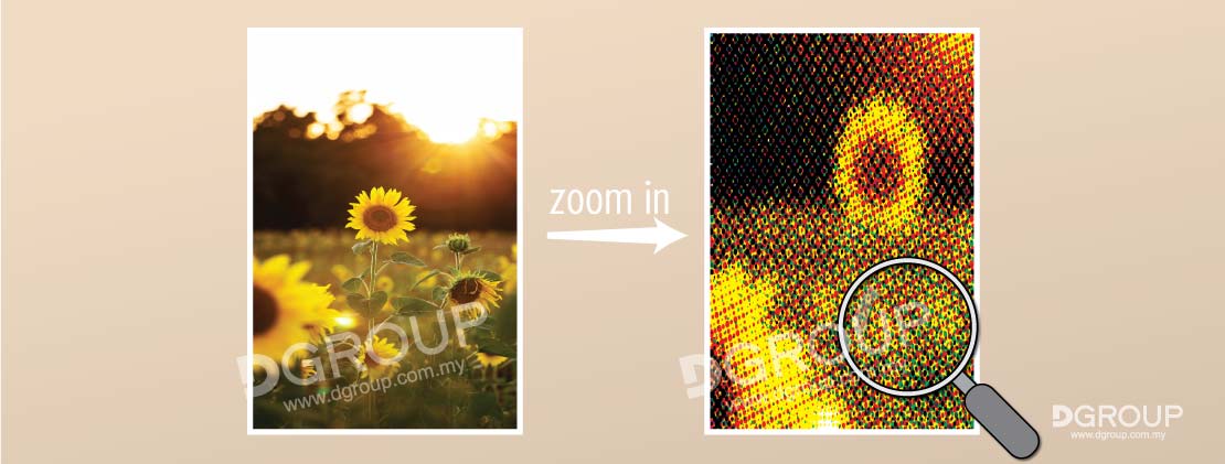
If you zoom in on the image, you will notice half-toning or little dots of colours layered over one another that creates the perception of a solid when looking at it.
The Good & the Bad
Why is Pantone the current colour leader in the industry? What traits do Pantone possess? As for CMYK, is it inferior to Pantone and has been completely replaced? Or does it have its own unique role? The tables below lay out their respective pros & cons and will provide answers to those questions.
PANTONE |
|
|---|---|
|
|
CMYK |
|
|---|---|
|
|
Key Takeaways
Check out the table below which compares the colour systems in regard to the printing industry!
| Comparison Points | PMS | CMYK |
|---|---|---|
| Usage of spot colours | ✔ | ✖ |
| Usage of process colours | ✖ | ✔ |
| Colour standardization | ✔ | ✖ |
| Ink colour consistency & licensing | ✔ | ✖ |
| Accessibility to average users | ✖ | ✔ |
| Colour range | High | Medium |
| Recommended applications |
|
|